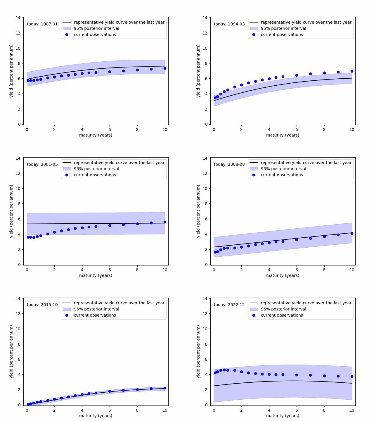
Modelling the representative yield curve over a year
- code
- raw data source: Filipović et al. 2022
The objects “representative yield curve over the last year” and “95% posterior interval” are derived from the Gaussian Process(GP) model. Specifically, for example, assume that today’s date is August 2023. We could construct a scatter plot that includes all observed yields from September 2022 to August 2023. The scatter plot would form a thick, sloping band if we set the X-axis to represent maturities. This band can be assumed to originate from the GP, which can be estimated using the observations in this band. Thus, the estimated GP is a representative snapshot of yields over the past year. In the above figure, the “representative yield curve over the last year” and “95% posterior interval” are the mean and 95% quantile band of the GP’s predictive distribution, respectively. We should use the predictive distribution because certain maturities are unobservable.
References
- Filipović, D., Pelger, M., and Ye, Y. (2022), “Stripping the Discount Curve - a Robust Machine Learning Approach,” SSRN Scholarly Paper, Rochester, NY. https://doi.org/10.2139/ssrn.4058150.

